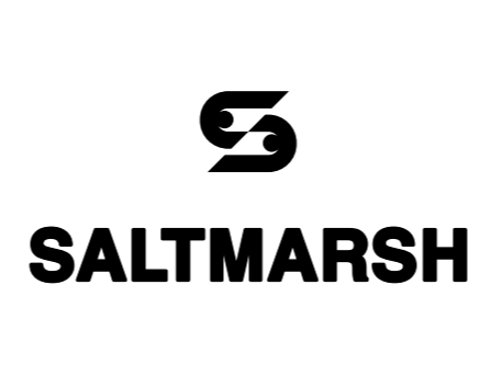
SALTMARSH LOGO UPDATE
BRANDING EXERCISE
An established accounting firm in the midst of a rebrand was presented with visual directions that favored modern abstraction, but lacked the clarity and authority expected in the financial services industry.
This concept explores an alternative direction, addressing those gaps while aligning more closely with industry expectations. Early proposals leaned toward expressive, modern visuals, but failed to communicate the credibility and trust central to the firm’s identity.
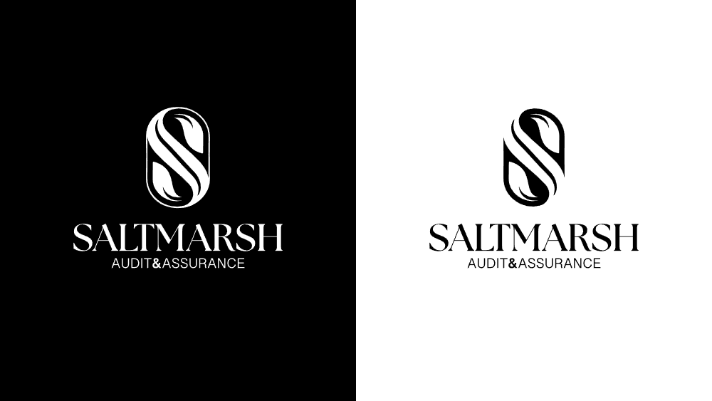
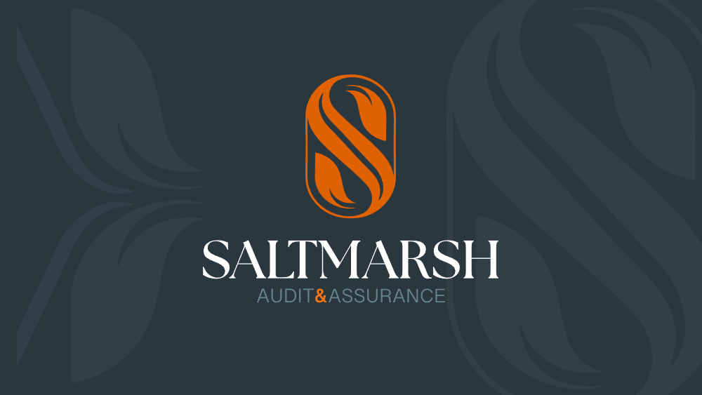
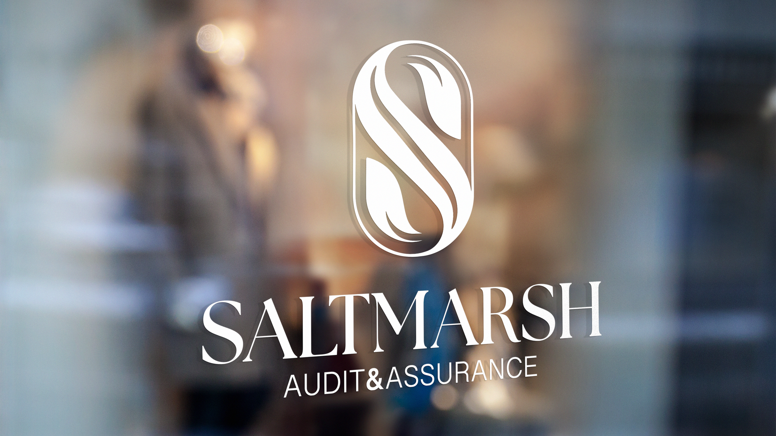
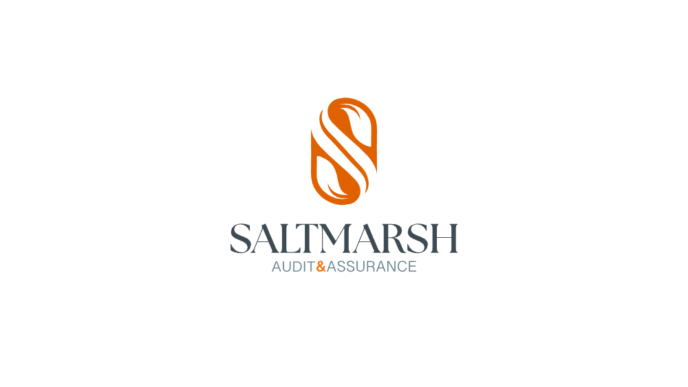
The proposed identity re-centers the brand around trust, structure, and longevity. A serif-driven wordmark is paired with a refined monogram inspired by traditional financial and editorial design systems, creating a visual language that feels grounded while still forward-looking.

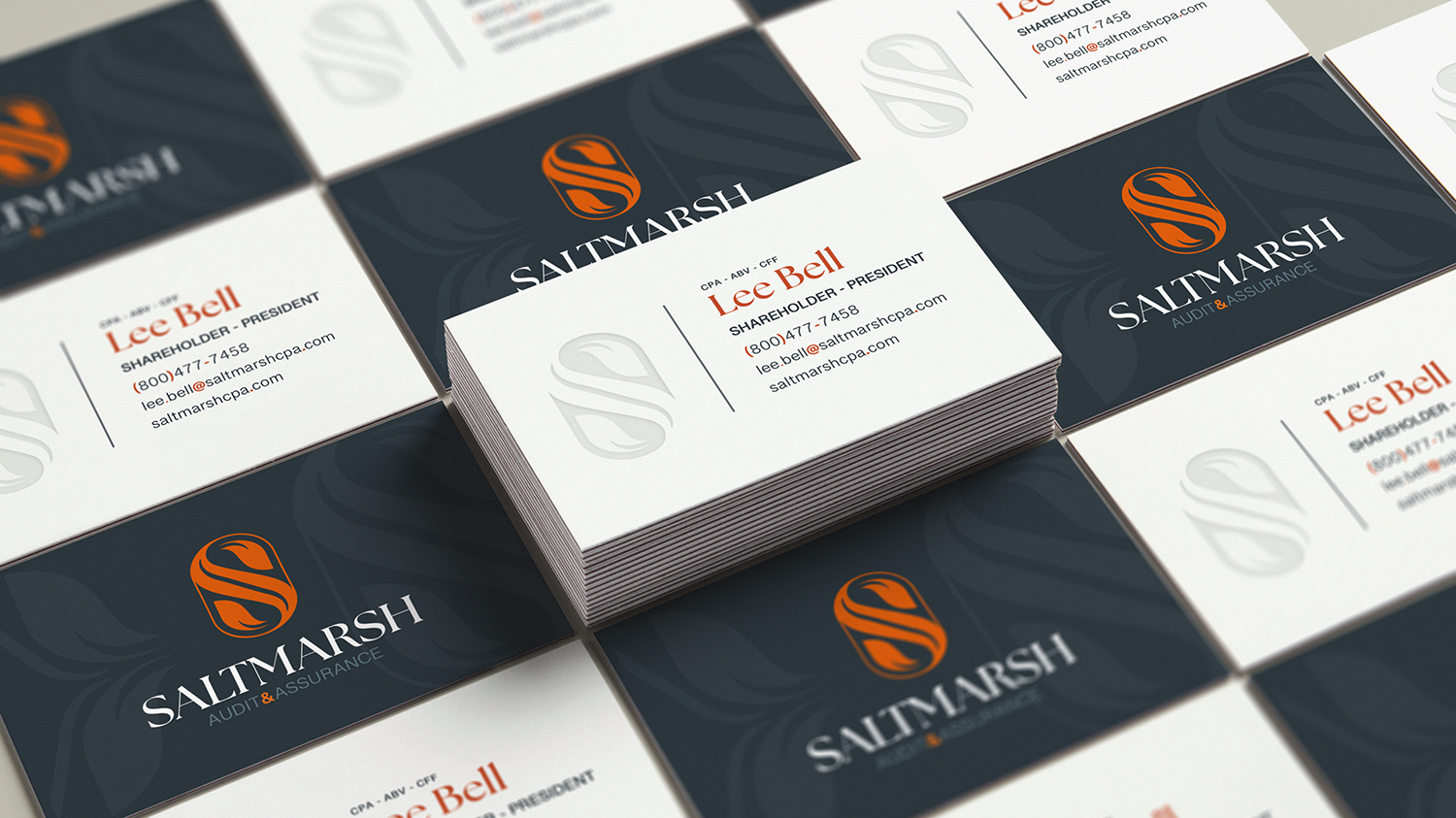

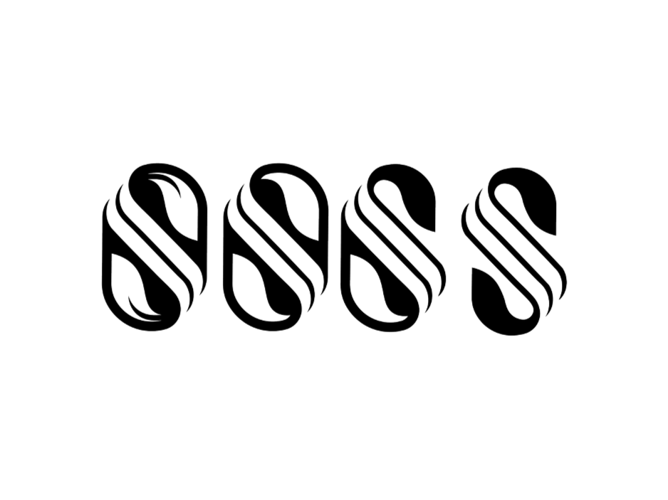
INITIAL LOGO CONCEPTS FROM VENDOR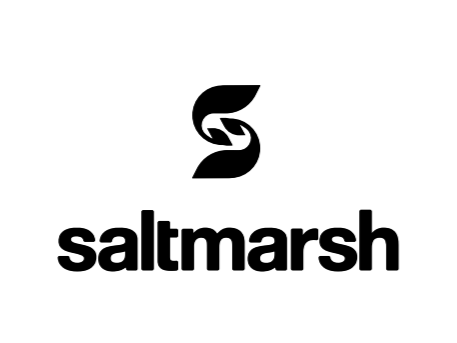
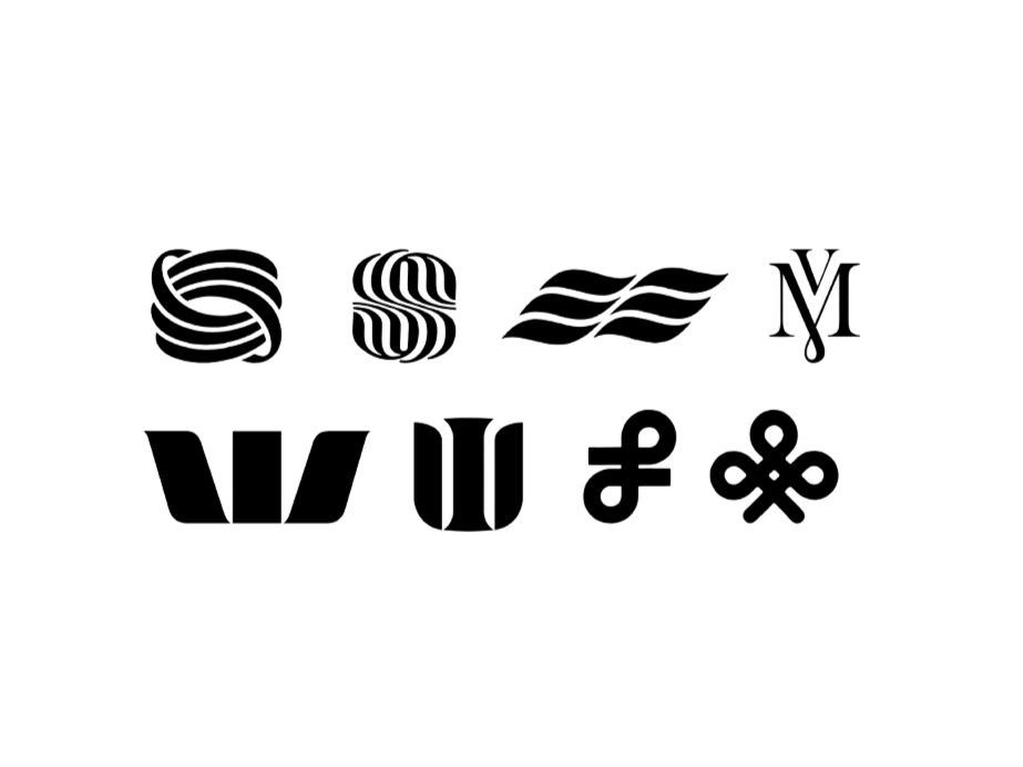
PROVIDED INSPIRATION & EARLY ITERATIONS